The Process of 1979:
- Kai Denton

- Dec 20, 2024
- 11 min read

It started back in August with a little doodle jotted down in my work notebook. I knew I wanted to make something festive for halloween but with the themes i've been expanding on in most of my recent work. Halloween paintings are always my most favorite to do, with a fondness for depicting the quaint and simple evening of adorning a costume and trick-or-treating. I've done that before with some other little characters of mine and wanted to create something that captured that nostalgia and atmosphere of Halloween night. I very quickly thought of my three characters walking down the street side by side in their uniquely fitting costumes, discussing the eventful night they had and most likely giving each other a hard time on their costume choices. One of my favorite things about drawing any character is getting inside their head and imagining what they're thinking or talking about; how they move and interact with the world around them. I really loved the Idea of one of them getting stuck carrying the other's costume pieces or belongings while also being freezing cold (100% from admittedly denying wearing a coat as to not take away from the costume's accuracy, despite his mom's insistence) and wearing very uncomfortable platform shoes and makeup. A level of commitment I strive for. They'll all make up by sunrise.
The planning and sketching process:
The very first thing I typically do is gather my references, wether it be through images I find online, ones I take myself or, if its simple enough, I'll sometimes use a cheap software to model my own. This Is only something i've started doing in the last year or so but I can tell a world of a difference in accuracy and quality! Whilst drawing exclusively from memory is a great and helpful skill to have, that mental library can only come from making a point of everyday observation or doing extensive studies from references. They are important and useful tools to advance your skill, and an integral part to getting the look I've recently become fond of. From there, I can push things and make it more stylized with help of those fundamentals. Yeesh, sorry for the teacher speil. Anyway, for this painting I started by forcing my mom (very nicely asking her) to walk into the street with me for what ended up being a really silly picture. This image was mostly to visualize the perspective I wanted in the street and in between the kids, and it got me to my next sketch.
I prefer to work traditionally 99% of the time, but that doesn't mean I don't also incorporate helpful digital methods. I start by doing the first rough sketch digitally so I can move things around a bit before printing that to scale and using my light box to transfer the guidelines to my sketch paper. I feel much more comfortable and like I have more control when sketching on paper as opposed to a screen and a digital software, but going in with a rough digital outline helps take some of that initial pressure off.

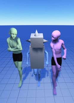
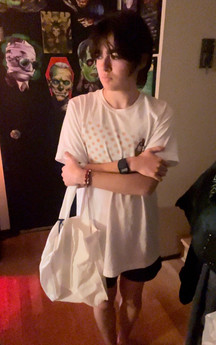
From there, I used an app called MagicPoser to throw in some models and pose them to the positions I wanted. SO, SO helpful to have. The anatomy isn't always spot on and sometimes the models warp and do weird things, but it at least gives you a general outline of what the pose you have in your head might look like and how to 'realistically' render it. I also went back later and got pictures of the street at night for a rough idea of the lighting, and took some pictures of me mimicking the poses while holding similar bags to the ones I envisioned. In hindsight, pillowcases would have been much more accurate to the times, but what can ya do. After getting all that and a couple extra pictures, I got my final sketch.
This is usually when I get impatient and decide to do a color test.

I took a well lit picture of my sketch and put it into procreate. Depending on the picture I was able to get I typically use either the Color or Multiply blend mode to paint overtop without covering my lines. I went for something more moody and kinda mysterious, though it doesn't really translate to the finished painting. However, I really liked how this looked. I debated using purples instead to make it more 'halloween' feeling and eerie and, while some people liked that version as well, I decided to go with the classic blue. Listen, I can't help myself. I'm always gonna go with blue. Because of the blend modes I was using for the lighting, it started doing what I can only think of calling a burn effect. You can sort of see it around the edges as a fade from green to yellow and then orange. I thought it was a cool effect and decided to try to carry it over to the painting to make the tone of the streetlights look dated.
Transferring to watercolor paper

I once again used my light box to trace my sketch onto watercolor paper. This time, I decided to try something different (without testing it... foreshadowing!) and used fluid watercolor paper from an 11x18 tablet I purchased. I traced it in a light pencil to start with to give me some room to add extra details and adjust things like hands or faces which can get warped. When using a light box with watercolor paper it tends to blur small details, so I typically save certain small elements for this step. Once I'm happy with the transfer, I begin the line-work!
the line-art process:


For the line-work in my paintings, I use either Higgins waterproof ink or a mix of various Dr. Ph. Martin's inks to create the needed colors. In this painting, I used turquoise, green and red respectively and mixed a little bit of black into each to create darker shades. Those are my go-to colors. This is also where doing a color test beforehand comes in handy because I can decide which ink colors to use and where to make it seamlessly blend with the paint. I also used a little bit of sepia and a lighter green. To apply it, I use a variety of dip pen nibs in my Tachikawa universal nib holder. Recently my favorites have been the Hunt 100 artist, Hunt 107, Brause 515, Gillotts artist, and Hunt 104 drawing nibs. Especially that Hunt 100 artist nib which is really flexible and comfortable to draw with. I also used a bit of colored pencil in the very light areas around the window to hopefully create a glowing effect. I used to almost entirely use Microns or a couple of Copic fine-liners, but once I found this method I haven't gone back. For me, the benefits of doing lines with a dip pen are custom ink colors and the variations in lines and techniques, things that I feel are noticeably absent in some of my older paintings. The lines for this painting were fairly simple with nothing too complicated, though there were some things I wasn't happy with.(foreshadowing!)
The painting process:
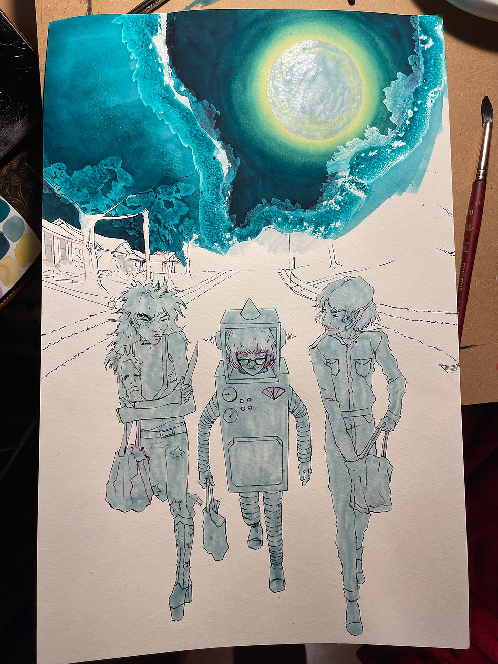
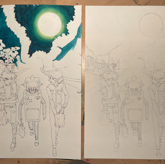
Alright this is where things start to go a bit downhill. After masking off parts of the painting (which I'll get into later) I began painting the sky. I've painted a couple of glowing moons using this technique before and it's always worked pretty well for me, but before we get there, it's time to address the underlying tones of foreboding. Despite my best efforts and reliable process, it wasn't looking right. I finally realized that it was the paper. It wasn't 100% cotton like I was used to and really enjoyed, and, though I thought that wouldn't make much of a difference, It definitely did - at least with my personal way of going about things. I didn't want to spend the rest of the painting fighting against my most important material and ending up with a final product that I wasn't happy with, so after some thought, I decided to start the line-work all over again on my Ol reliable, Arches 140lb cold press 100% cotton paper.
So back to the light box we go! I did mostly everything the same, except for a few fixes. I made the ribs on Cosmo's (center) tube sleeves and legs cleaner and more consistent, cleaned up Andy's (left) bangs, and overall added a bit more detail. In the end, I came away from it with a better result that I was happier with and a lesson learned. Ok now to the ACTUAL painting process.
Masking:
I masked everything off almost the same as before with Holbein soft tape and Pēbēo drawing gum. That will protect areas of the painting that I want to stay white so I can paint the background freely without having to avoid painting inside the lines. For large areas, I used a cheap brush coated in a bit of brush soap. That protects the bristles and prevents the masking fluid from drying as quickly on the brush and ruining it, though I was still sure to wash it out well immediately after use. For small details, I used either a spongey masking fluid applicator or a dip pen. I was surprised you could use it with pen nibs at first but it actually works really well and can simply be peeled off when you're done. I also went about masking the trees off differently by only doing the absolute brightest points of the tree and feathering it out more. I'm really glad I did.
lets actually paint something!
By far my favorite paints to use are Golden's Qor watercolor paints. They're incredibly smooth and vibrant and work perfectly for what I like to do! I dry mine in either half or full pans, though for this painting I used the Masterson watercolor palette for the first time and LOVED it. My setup is usually pretty simple: A couple palettes, two cups of water (one for mixing and one for cleaning), a towel, my brushes, a spray bottle and some pipettes for transporting water.
After masking off the moon, I began painting around it with my lightest color. A pale yellow, in this case. From there, I went in with a pthalo turquoise and painted just outside of the yellow, using a clean, wet brush I already had at the ready to blend the blue slightly into the yellow, being sure not to paint completely over it. I repeated that process with a mix of pthalo turquoise and Indigo around the outermost part of the sky and blended it into the center. If i'm worried about picking up any color, I'll use multiple large brushes at a time each holding one of the colors and one with clean water, going over it multiple times until I've built up a smooth-ish gradient. Its stressful and I look a bit crazy while doing it, but I love the effect it makes. I'm also not great at describing how I do things so bare with me...
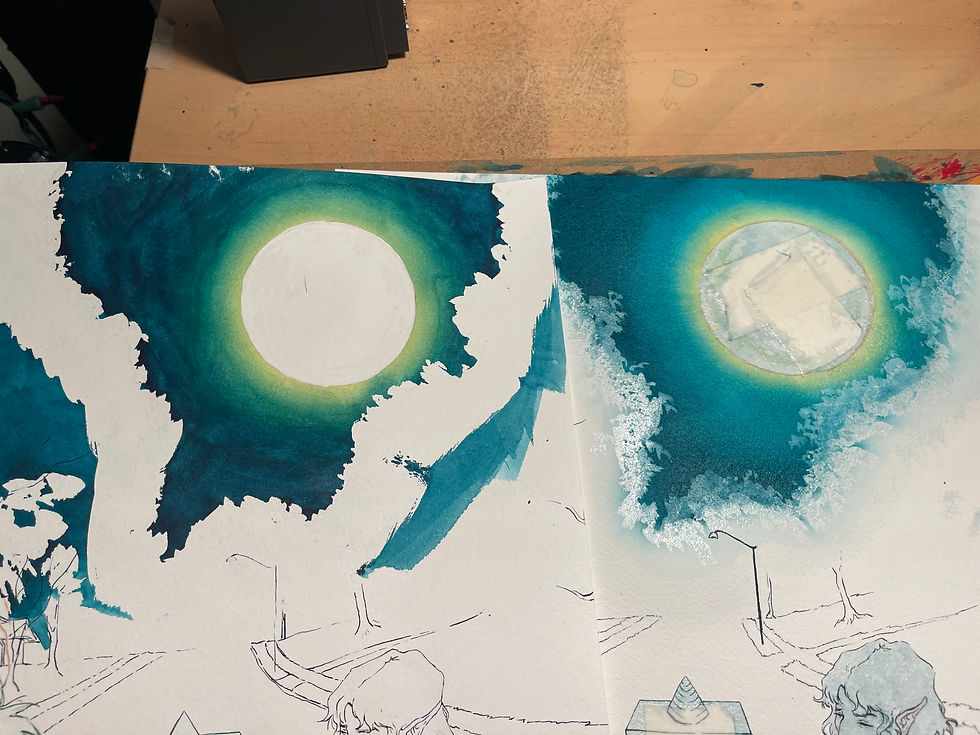
After a couple passes of that, It looked like this. This isn't to diss Fluid paper, It's great for other uses, but there's an obvious difference in how it handled the specific techniques I was using. On the Fluid paper, I couldn't get the paint to stop moving around and sitting on top of itself, whereas the Arches absorbed the paint beautifully and helped it to easily blend into itself in a flat, even layer. So if you're getting frustrated with what you're doing and you feel like giving up, try something new! It might not always be the total fault of your abilities.

I then used those same turquoise and indigo colors to paint the trees, making it lighter by the moon kissed edges and darker as it sank to the ground. The grass got the same treatment, keeping it lighter in the areas where the glow of the street lamps would be hitting it. I kept it very light around the illuminated windows and on the parts of the trees that faced them, and I gave the road and sidewalks a light wash of greenish yellow. While painting, I had to keep in mind the various lighting elements: The moon and its light casting on the tops of the trees, the windows and their light on the bottom of the trees and the grass, and the two street lamps, one in the back and one out of sight somewhere in the foreground shining light from above on our three characters and on the road in the background.

After removing the masking on the moon and trees, I proceeded with a light yellow wash in all the areas that were left white. As well as that, I went in with a dull indigo to start building up the shadows in the background of the road and on the road's edge. I then used an even darker indigo to deepen the trees in the background and push that contrast even further.

Part of the reason why my paintings take me so long is I build my layers up extremely slowly. I've gotten a bit quicker in the last year or so as I make more paintings and get a better feel for watercolor as a medium and the process I've picked up along the way, but I still have the tendency to work slow and tediously. I added a very subtle texture to the moon using a darker shade of yellow and built up the layers of leaves in the trees. I wanted there to be multiple sections of different intensities of lighting, with the very edge being the most illuminated by the moon and the leaves in the middle and at the bottom being engulfed by a mysterious darkness. I also added some more texture and shading to the road and its cracks. I remember being really intimidated by the road because it was a large part of the painting that was just a big chunk of flat color. I tried my best to give it some variety and realistic texture so it didn't stand out as too much of an eye sore. I was pleasantly surprised by how it came out! Other than that, more texture, more shading, more lighting. Rinse and repeat. Once I was happy with where it was, I removed the masking fluid on the characters and shifted my focus towards them.

The characters in this painting were by far my favorite part of the whole process! While painting the background was tedious and honestly kinda scary with making sure I left enough light while also pushing enough values, the costumes were just fun. I wanted to give them that same 'burn' lighting effect, and it was really interesting to try and figure out how that warm light would effect how I imagined the colors. I gave everything a washed out green-ish tint, which I feel is especially prevalent on Andy and Johnny's hair and costume. I always love adjusting the colors and style of various pop culture things to fit the spacey theme I try to go for. When it comes to the lighting and shading of this piece, it's something I think I'm the most proud of.

Once again, I just kept on adding shading layer by layer. I remember being especially happy with that little line of shadow coming from Cosmo's robot head. I used a bit of ochre and red to soften the edge of the shadow and give it a warmer appearance. Johnny's jumpsuit was a bit tricky because I wanted to make it apparent that it was meant to be that classic dark blue while also keeping the lighting consistent, and I had a hard time balancing that with the hair as well. Andy might be my favorite, though! He looks so washed out in the light and theres something about how the green looks that puts him perfectly in the environment, plus I love how the red pops with the green and the white of the face paint. Another addition were their shadows on the ground. I used that 3d software and put a light source in the rough position I wanted it to be in to get an idea of what sort of shadow would be cast in that environment. I feel like the soft edges with ochre and red make the lighting even more prominent and really helped to tie the whole thing together!

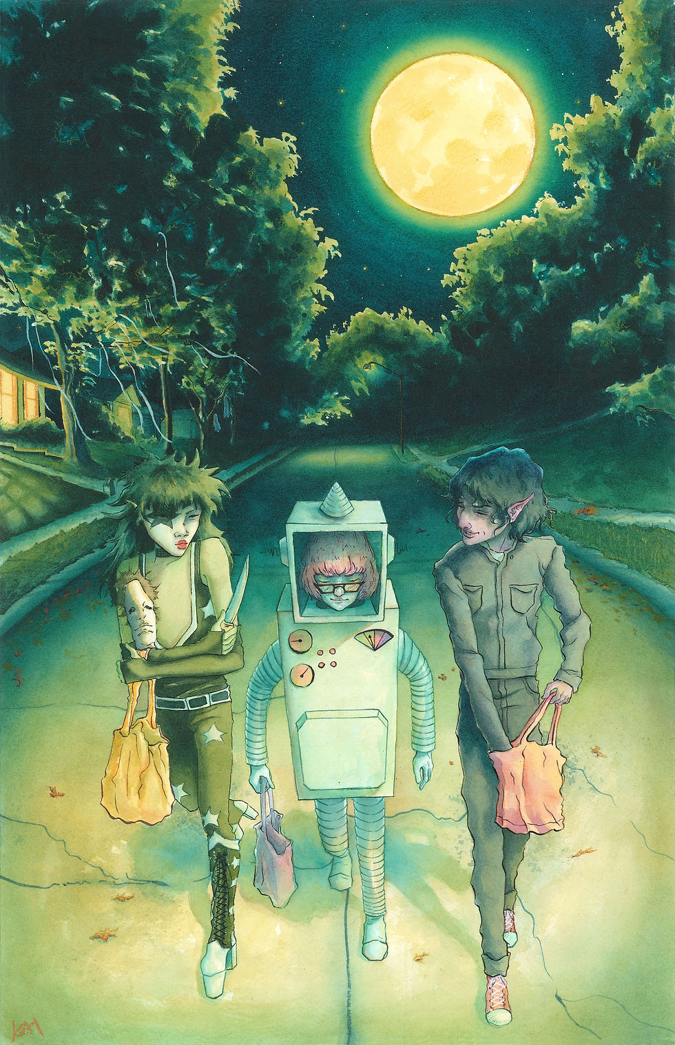
For the final touches, I added some stars in the sky, bundles of leaves on the ground, and toilet paper swaying in the trees. Clearly there was some fun our little guys missed out on. I also added just a bit of shading to the bags and, I can't even lie, by this point I was ready to call it done. Total detailed rendering started mattering less and less, but in the end, I was pretty happy! Something that surprised me about this painting was how quickly it came together. I'm just so used to paintings taking me months. At first I was worried that because It didn't take me as long the quality had suffered and I should've done it differently, but after comparing it to other paintings and reflecting on the things that inspired me with this particular piece, that feeling soon faded. It has a very different tone from the other 'Too Far Out' paintings, but I think that works to its advantage in this case. It looks mysterious and nostalgic and, most importantly, halloweeny. Looking back, I'm sure they'll remember a particular halloween fondly: Halloween, 1979.






Comments